Need a HEX code from an image?
Use a color picker from image when you need the exact color from a photo, logo, screenshot, product image, UI mockup, or brand asset. Instead of guessing a shade by eye, you can click the image and copy a precise HEX, RGB, or HSL value for CSS, design tools, presentations, thumbnails, and social media graphics.
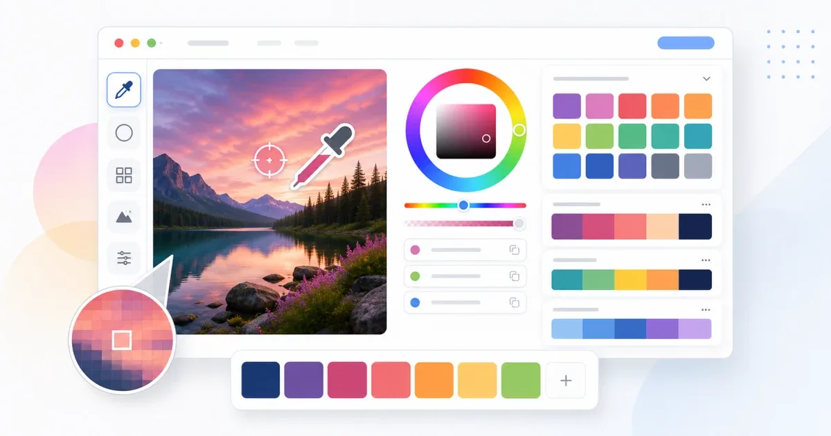
The free Color Picker on IGY Apps works in your browser. Upload an image, click the pixel you want, then copy the color code. There is no signup, and the image color picking happens locally in the browser.
If you arrived here searching for "image color picker", "color picker from image", "HEX from image", "pick color from photo", or "color code finder", the workflow is the same: turn a real visual source into a reusable color value.
Quick workflow
For the fastest result:
- Open the Color Picker.
- Upload your image, logo, screenshot, or product photo.
- Click the exact area you want to sample.
- Copy the HEX code for websites and CSS.
- Copy RGB if another editor asks for red, green, and blue values.
- Copy HSL if you want to adjust lightness or saturation later.
- Save the color to your palette if you want to compare several samples.
If the target area is small, crop the image first with Crop Image. A tighter crop makes it easier to click the correct pixel and avoid nearby colors.
What makes a good image color picker?
A useful image color picker should do more than show a random swatch. For design work, you need a tool that makes the picked color easy to reuse.
Look for these basics:
- Image upload or drag and drop.
- Pixel-level selection from the visible image.
- HEX output for CSS and web design.
- RGB output for image editors and presentation software.
- HSL output for lighter, darker, and softer variants.
- Copy buttons so you do not mistype color values.
- A way to save or compare several colors.
The IGY Apps Color Picker is built for that practical flow: sample the color, copy the value, then keep working without installing a design app.
HEX, RGB, and HSL: which code should you use?
HEX is usually the best choice for websites. If you are editing CSS, a theme, a landing page, a button, a border, or a background, copy the HEX value. A color such as #2563EB is compact, readable, and accepted by most web tools.
RGB is useful when another app asks for separate red, green, and blue channels. It is common in image editors, presentation tools, and some desktop design software. RGB can also be easier to inspect when you want to compare how much of each color channel is present.
HSL is useful when the exact color is right but the brightness is not. Keep the same hue, then adjust lightness or saturation to create hover states, subtle backgrounds, softer borders, or darker text colors.
Color picker vs palette generator
A color picker answers one question: what is the exact color from this pixel?
A palette generator answers a different question: what colors work well with this base color?
Start with the Color Picker when you need to extract a real color from an image. After you pick the base color, use the Color Palette Generator to create complementary, analogous, triadic, or monochrome combinations for a full page or brand asset.
For more image-related workflows, the Image Tools category includes tools for editing, resizing, compressing, cropping, converting, and sampling colors from images.
Common use cases
An image color picker is useful when you need a color that already exists somewhere:
- Extract the HEX code from a logo or brand screenshot.
- Match a website section to a product photo.
- Pick a background color from packaging, furniture, clothing, or a room photo.
- Rebuild a UI from a screenshot when the original design file is missing.
- Choose accent colors for YouTube thumbnails, banners, ads, and social posts.
- Build a mood board into a usable website palette.
- Check whether two colors from separate images are actually the same.
- Copy a color from an old graphic before updating it in a new format.
If the image needs cleanup first, open the Image Editor. You can crop or adjust the visual, then return to the color picker for a cleaner sample.
Avoid these color picking mistakes
The first clicked pixel is not always the right final color. Photos and screenshots can contain lighting changes, compression artifacts, shadows, reflections, and anti-aliased edges. A logo exported as a JPG may also include slight variations around the edges.
Before you decide:
- Sample two or three nearby pixels from the same area.
- Avoid shadows, highlights, glare, and transparent overlays.
- Zoom in before clicking small icons or text.
- Prefer PNG or WebP for sharp interface screenshots and logos.
- Compare the picked color against both white and dark backgrounds.
- Do not pick from a filtered social media preview if you need the original brand color.
Flat graphics, SVG exports, and UI screenshots often need only one click. Product photos usually need a few samples before you find the representative color.
Check contrast before publishing
Finding a beautiful color is only part of the job. A color that looks good inside a photo can fail when used as text, a button, or a background.
For text, make sure the contrast is strong enough against the background. For buttons, test the normal state and the hover state. For banners and thumbnails, check whether headings, labels, and icons remain readable at smaller sizes.
If the color is too light or too saturated, copy the HSL value and adjust lightness or saturation while keeping the same visual family. This is often better than choosing a completely different shade.
Best workflow for designers and developers
Use this workflow when the color needs to be reliable:
- Choose the cleanest source image.
- Crop the image if the target area is small.
- Open the Color Picker.
- Pick the main color from the image.
- Compare nearby pixels if the source is a photo.
- Copy HEX for CSS, RGB for channel-based tools, or HSL for adjustments.
- Send the base color to the Color Palette Generator if you need a full palette.
- Check contrast and readability before publishing.
FAQ
Can I pick a color from an image without installing software?
Yes. Open the Color Picker, upload the image in your browser, click the color you want, and copy the HEX, RGB, or HSL code.
What is the best format to copy for CSS?
HEX is usually the simplest choice for CSS. Use RGB when another editor asks for color channels, and use HSL when you want to create lighter or darker variations.
Why do I get different colors from the same photo?
Photos contain shadows, highlights, compression, and camera noise. Click several nearby pixels and choose the value that best represents the real object or brand color.
For quick color sampling, open the free Color Picker, upload your image, click the exact pixel you want, and copy the HEX, RGB, or HSL code instantly.